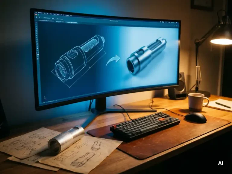
Technical products often carry enormous complexity beneath the surface. Whether it is a medical diagnostic device, an industrial sensor, or a precision instrument, the engineering behind these products can be sophisticated to the point where even trained users struggle to interact with them confidently. Industrial design has a powerful role to play here: not just shaping how a product looks, but actively making it easier to understand, use, and trust. When done well, good design transforms technical complexity into intuitive clarity without sacrificing any of the underlying capability.
The challenge is real and growing. As products become more feature-rich and technically advanced, the gap between what engineers build and what end users can comfortably navigate tends to widen. Bridging that gap requires more than a clean aesthetic. It demands a deep understanding of both the technology and the people who will use it. That is precisely where technical product design and human-centered thinking intersect to create something genuinely valuable.
Where complexity hides in technical product design
Complexity in technical products rarely announces itself. It hides in poorly labeled controls, in feedback signals that mean nothing to the user, in interfaces that reflect the logic of the engineer rather than the mental model of the person operating the device. The result is friction: hesitation, errors, and a loss of confidence that can undermine even the most capable product.
Understanding where complexity lives is the first step toward resolving it. Often it accumulates gradually, as features are added incrementally without a unified design vision holding them together. A button added here, a status indicator there, and suddenly a product that was once straightforward becomes a source of confusion. Identifying these pain points requires looking at the product not as its creators see it, but as a first-time user would encounter it.
How visual language translates technical logic into intuitive form
Visual language is one of the most powerful tools available in product design. Shape, color, texture, proportion, and spatial hierarchy all communicate meaning before a single word is read or a single button is pressed. When these elements are aligned with the product’s logic, users instinctively understand what to do next.
Consider how the physical form of a product can signal its function. A grip that naturally fits the hand communicates where to hold it. A control that protrudes slightly from a surface invites interaction. A display area that is visually separated from mechanical components tells the user where to look for information. These are not decorative choices; they are functional decisions made through the language of form. Skilled industrial design services translate technical logic into these kinds of intuitive cues, reducing the cognitive load on the user and making the product feel immediately approachable.
The role of user research in simplifying product interaction
Simplification without understanding is just guesswork. Genuine product usability improvements come from observing real users in real contexts, understanding their goals, their assumptions, and the moments where they get lost. User research provides the evidence base that separates meaningful design decisions from aesthetic preferences.
This research can take many forms: contextual observation, usability testing, expert interviews, or structured feedback sessions with target user groups. What matters is that findings are translated directly into design requirements. If users consistently misread a status indicator, that is not a user education problem; it is a design problem. Research makes these issues visible and provides the direction needed to resolve them effectively. The insight gained at this stage shapes everything from form factor to interface layout, ensuring that design simplification is grounded in genuine human behavior rather than assumptions.
When interface design and industrial design work as one
Some of the most significant usability improvements happen at the boundary between physical form and digital or analog interface. When industrial design and interface design are developed separately, mismatches are almost inevitable. A screen positioned at the wrong angle, controls placed too far from the information they affect, or visual feedback that contradicts the physical action required: these are the kinds of problems that emerge when the two disciplines operate in silos.
When they work together from the start, the product becomes coherent. The physical and the interactive reinforce each other. A user’s hand reaches naturally for the right control because the form guides them there. The interface confirms the action clearly because the designers who shaped the housing also understood the feedback loop. This integration is not just good practice; it is increasingly essential as complex technical products incorporate more digital touchpoints alongside their physical components. A holistic approach to user experience treats the product as a single system, not a collection of separate design tasks.
Measurable outcomes: design clarity and market performance
Design clarity is not just a qualitative goal. It has measurable consequences for how a product performs in the market. Products that users understand quickly generate fewer support requests, fewer returns, and stronger word-of-mouth recommendations. Training time decreases. Errors in operation become less frequent. These outcomes translate directly into cost savings and competitive advantage.
Beyond operational metrics, design clarity also shapes brand perception. A product that communicates confidence and ease of use reflects well on the company behind it. In markets where technical specifications are increasingly comparable across competitors, the user experience of the product itself becomes a meaningful differentiator. Companies that invest in thoughtful technical product design are not just improving usability; they are building a reputation for quality that supports long-term market positioning. The connection between design investment and commercial return becomes clearer as products reach more demanding users and more competitive markets.
How code2design helps with simplifying complex technical products
We approach this challenge through our 360° design methodology, which combines deep user insight, technical expertise, and strategic market thinking into a single integrated process. At code2design, we work with manufacturers of sensors, medical devices, industrial equipment, and precision tools to make products that are as easy to understand as they are technically advanced. Here is what that looks like in practice:
- User research and contextual analysis to identify exactly where complexity creates friction for real users in real environments
- Visual language development that translates the product’s technical logic into form, proportion, and material choices users respond to intuitively
- Integrated interface and industrial design so that physical and digital touchpoints reinforce each other throughout the interaction
- Full-service development support from initial concept through to production-ready design, reducing time-to-market and relieving pressure on internal teams
- Strategic design positioning that ensures the product communicates brand identity while delivering outstanding usability
With over 75 international design awards and more than 25 years of experience, we bring both creative ambition and proven methodology to every project. If your product carries technical complexity that users struggle to navigate, we would be glad to explore how design can make it clearer, more compelling, and more successful in the market. Get in touch with us to start the conversation.
Ähnliche Artikel
- Was ist eine Innovationskultur und warum ist sie wichtig?
- Welche Kommunikationsfehler führen zu schlechten Industriedesign Ergebnissen?
- Welche Rolle spielt Blockchain in der Produktentwicklung?
- What is the difference between iteration and pivot?
- Welche Versicherungen braucht man für Industriedesign Projekte?